Building maps in R has several advantages over using point and click interfaces such as QGIS. The scriptable nature makes it easy to run batches of similarly styled maps. If you use R for spatial analysis you also don’t need to leave a familiar environment to learn a new tool.
In this first installment of a series of tutorials we’ll give tips and tricks on how to render beautiful maps in R. You will learn how to create a clean world map, annotating some sites of interest, while adding some additional features such as a type of land cover. Using this tutorial you should be able to build variations on this map according to your needs. Word of caution, we do assume a certain familiarity with the ggplot2 aesthetics syntax. So, let’s get started.
Setting up the environment
Before we begin building the map we must load some required libraries to assist in our map building work. These include general data wrangling packages tidyverse, and the sf and raster packages to deal with vector and raster based geo-spatial data. In addition, we’ll need the rnaturalearth package to download vector based map data. Finally, both ggrepel and showtext are there to provide fancy formatting for text.
# read libraries
library(tidyverse)
library(rnaturalearth)
library(sf)
library(raster)
library(ggrepel)
library(showtext)
font_add_google(
  "Lato",
  regular.wt = 300,
  bold.wt = 700)
After loading all these packages we need to access the data we want to use in this project. So we’ll use the rnaturalearth functions to download both outlines of the land surface, and a map of countries. We also read in a layer of MODIS land cover classes, which can be downloaded from the LP DAAC. We also generate some fake points of interest.
# read vector data using rnaturalearth
land <- ne_download(
  scale = 50,
  type = "land",
  category = "physical",
  returnclass = "sf")

countries <- ne_countries(
  returnclass = "sf",
  scale = 50)

# create dataframe with fake locations
df <- data.frame(
  site = c("A", "B"),
  lat = c(30, 40),
  lon = c(0, 0)
)

# read in the land cover data
lc <- raster("modis_land_cover.tif")
Since we are using ggplot2 we will have to use ‘tidy’ data rather than matrix based raster data. In order to make use of the raster based MODIS land cover map we convert it to a long format with x and y coordinates. We also pool all classes which contain trees into a final binary map (retaining only the pixels with content).
# select only "tree" areas (classes 1 - 9)
# and convert to binary (1 == tree)
lc <- (lc > 0  & lc < 9)

# reassign the name of the variable "lc"
# see below
names(lc) <- "lc"

# convert from matrix to long format
# 1 row per location
lc <- lc %>%
  rasterToPoints %>%
  as.data.frame() %>%
  filter(lc != 0) # only retain pixels with a true content
Building the map
Now we have all the data we can start building the final plot. For illustration purposes we’ll cover this step by step, and showing the intermediate maps. We’ll first lay down the basic outline of the land area, this is the foundation of our map pie. This is a trick which will become obvious in the next step. In each step I crop the map to size. Normally, you do this at the end of your routine, but to keep the maps small I’ll repeat this part in each step.
p <- ggplot() +

  # first layer is the land mass outline
  # as a grey border (fancy)
  geom_sf(data = land,
          fill = NA,
          color = "grey50",
          fill = "#dfdfdf",
          lwd = 1) +

  # crop the whole thing to size
  coord_sf(xlim = c(-30, 50),
           ylim = c(20, 70))

print(p)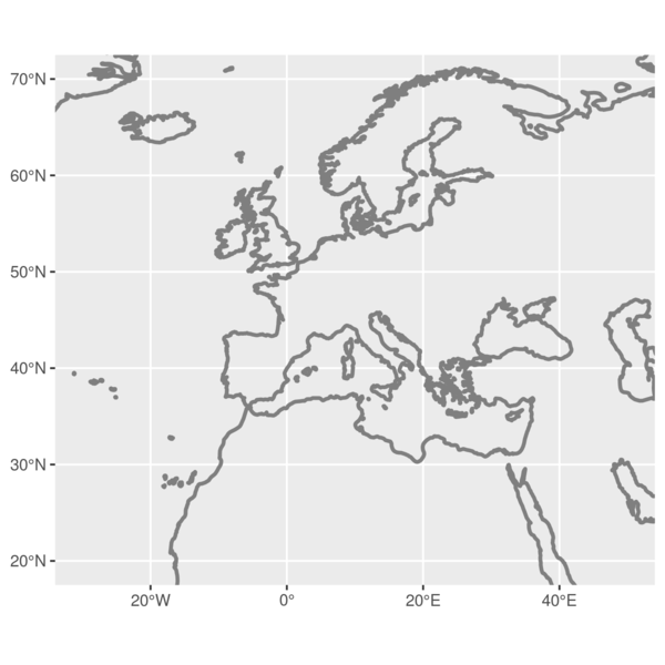
In the next step we add the countries, however we use a slightly thinner line width for the outlines of the countries. Together with the land mass boundaries plotted before this generated a faux drop shadow effect.
When dealing with planar projections you can use the sf function st_buffer() to calculate a true buffer around your polygons. However, with a large area in a non-planar projection this is not possible. This is a cheeky workaround for this issue.
p <- p +

  # second layer are the countries
  # with a white outline and and a
  # grey fill
  geom_sf(data = countries,
          color = "white",
          fill = "#dfdfdf",
          size = 0.2) +

  # crop the whole thing to size
  coord_sf(xlim = c(-30, 50),
           ylim = c(20, 70))

print(p)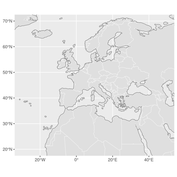
Now we can add some content to our map. We’ll add the raster data with forest locations first, giving it a dark olive green colour. Note that we’ll add the country layer again, but without a fill value. This is required to plot the country boundaries over the raster data.
p <- p +

  # then add the tree pixels
  # as tiles in green
  geom_tile(data = lc,
            aes(x = x,
                y = y),
            col = "darkolivegreen4") +

  # overlay the country borders
  # to cover the tree pixels
  # fill = NA to not overplot
  geom_sf(data = countries,
          color = "white",
          fill = NA,
          size = 0.2) +

  # crop the whole thing to size
  coord_sf(xlim = c(-30, 50),
           ylim = c(20, 70))

print(p)
With this done, we add the labels. Note that we use the
 ggrepel package and the geom_text_repel() function for this. This makes it possible for you not to worry about the placement of the labels as these are assigned automatically in order to avoid overlapping. We refer to the package
Note the ‘seed’ argument used. This is set to a fixed value in order to maintain the label positions stable between renders. When this value is random, your placement of labels will be so too. The end points of the label segments (lines) are accentuated with a simple grey point rendered by geom_point().
p <- p +

  # add the locations of the sites
  # as a point
  geom_point(data = df,
             aes(lon, lat),
             col = "grey20") +

  # use ggrepel to add fancy
  # labels nudged to a
  # longitude of -25
  geom_text_repel(
    data = df,
    aes(lon,
        lat,
        label = site),
    nudge_x      = -25 - df$lon,
    direction    = "y",
    hjust        = 0,
    segment.size = 0.2,
    seed = 1 # ensures the placing is consistent between renders
  ) +

  # crop the whole thing to size
  coord_sf(xlim = c(-30, 50),
           ylim = c(20, 70))

print(p)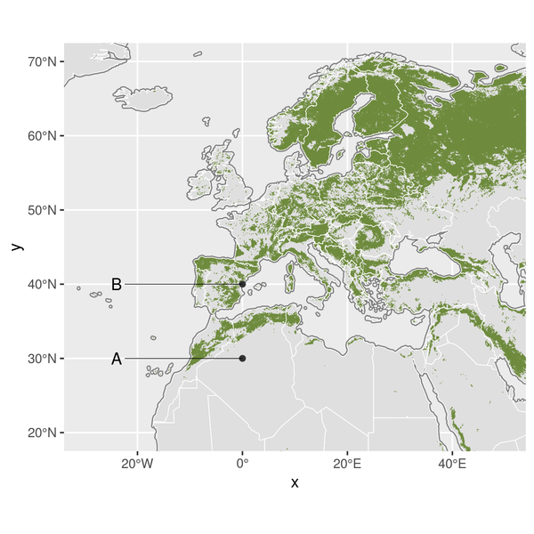
At this point we have a rather clean map but you can argue that given the size of the map we can do away with the grid lines and axis labels. You can tackle these map wide features by either adjusting a theme inline or creating a separate theme function to append to your ggplot2 layout. We’ll do the latter.
The theme below specifies the font used, and colour of the text. It sets all axis, tick marks, and grids to empty (element_blank()), while specifying the background colour of the map (lightblue). We then apply this theme to the previous plot.
For clarity the margins are kept at 0 which generally does not influence general plotting. However, you can set these to negative values to remove the “excess” border around plots should you want to have a tight crop.
theme_map <- function(...) {
theme_minimal() +
theme(
text = element_text(family = "Lato", color = "#22211d"),
axis.line = element_blank(),
axis.ticks = element_blank(),
axis.title.x = element_blank(),
axis.title.y = element_blank(),
axis.text = element_blank(),
panel.grid.major = element_blank(),
panel.grid.minor = element_blank(),
plot.background = element_rect(fill = "lightblue", color = NA),
panel.background = element_rect(fill = "lightblue", color = NA),
plot.margin = margin(0,0,0,0,"cm"), # <- set to negative to remove white border
panel.border = element_blank(),
...
)
}
p <- p +
# apply the map theme as created above
theme_map()
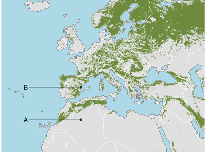
print(p)And so, after stacking layer after layer your first ggplot2 map is done! The animation below steps through the whole process. Keep an eye on our blog for new entries in this series on map building, and tips and tricks to improve your R mapping skills. The code for this project can be found on our github R tutorials page.
